Assignment Format
Online Submissions
All tasks and assignments should be submitted by copying & pasting your finished project into your Student Portfolio. FORMAT is the way the finished assignment looks or appears, which is different from its CONTENT. Before you submit your project for feedback or grading, check format:
Format Checklist:
1. The assignment was created in the correct layout requested, usually landscape or portrait.
2. The assignment is in an appropriate body font, with an attractive and readable header font.
3. The body font is in a readable point, or size ( usually 12-point for printed, but it can vary from 10 - 14 point in online situations).
4. Images are well-chosen and embedded into the project in an appropriate way.
5. Project has a consistent visual appearance, whether a paragraph, presentation, essay, or moodboard.
|
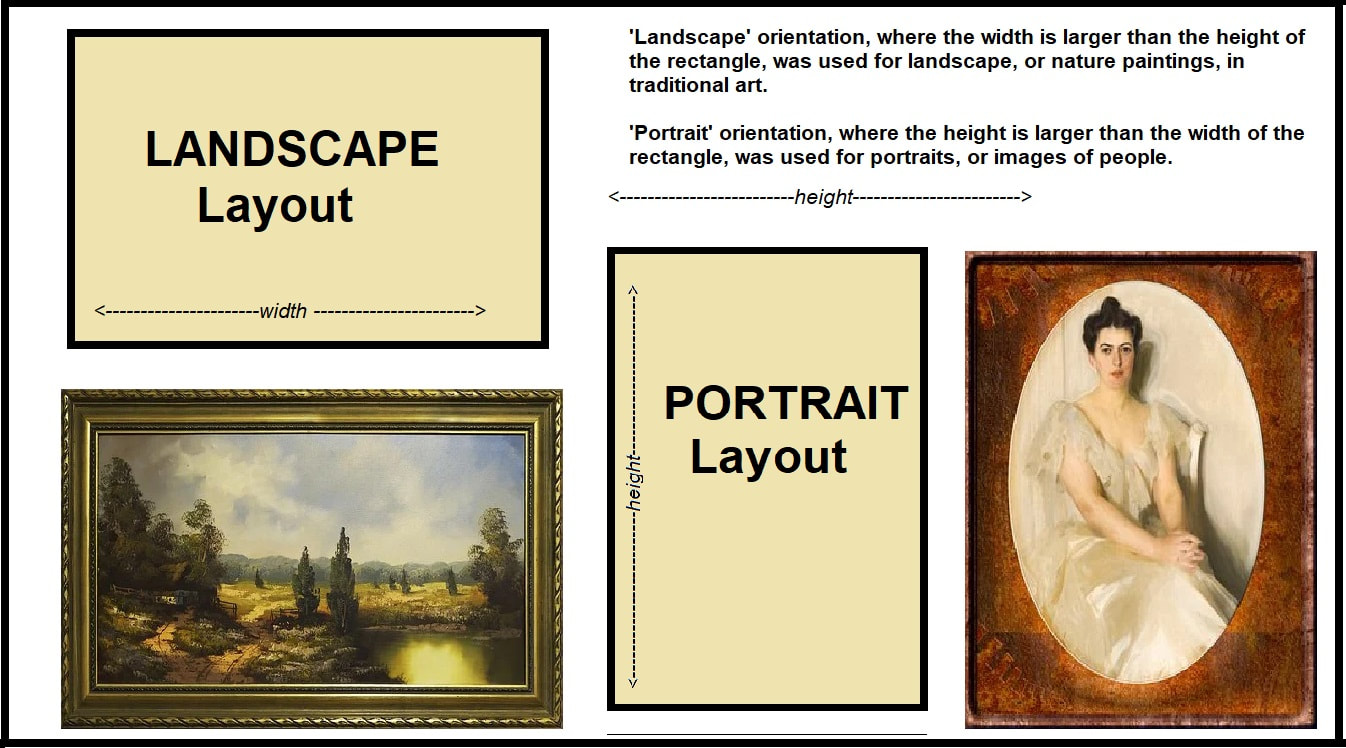
1. LAYOUT CHOICES
Depending on the assignment, your professor may request you to hand in an A4 project / poster in portrait layout, or a moodboard / PPT slide in landscape layout. Sometimes you will be able to choose the layout for your project. Your assignment does not always have to be A4, or even rectangular, but these are the two most common layouts for printed work, and they remain important even for digital work. |
|
|
2. FONT CHOICES
Your professor actually dislikes serif fonts (for example, Times New Roman) for reading body text, and prefers sanserif (for example, Calibri ). NOTE: She is an exception, because most academics require your writing to be formatted in Times New Roman or similar serif fonts. However, she personally finds serif fonts harder to read, and would appreciate you choosing a sanserif, especially for longer texts like your essays. Titles and headings, however, may be in any readable, attractive, appropriate font of your choice! Notice that decorative fonts have strong 'feelings' and usually match a specific aesthetic (see the Design Era assignment), so choose the best one for your project. |

Letter with serifs Letter sans (without) serifs
|


3. Font Size
This will depend on your project: for most academic body texts, 12-point is considered standard. However, headings, labels, and titles should be proportionately larger to create visual hierarchy (what we look at first and consider the most important). We often use size or weight to draw attention to those parts of our project. Numbers (#) and underlining can also help to create hierarchy.
In visual projects, such as posters and moodboards, you can often break the academic rule and play with size and weight much more dramatically. However, if your text is there to convey information, make sure that your typography is legible/readable! The example posters below show a variety of approaches. In #1, every letter must be clear to get the 'vote' message across, while in #2 some of the text ('POW', 'BAM') is only decorative, in #3 the 'feel' of the adjectives are more important than what they say, and in #4 the large letters are used as a purely decorative element.

4. Image Embedding
Depending on your project, images can be added at the last moment (essay) or are an integral and essential part of the work (moodboard). You might choose to use 'text wrap' settings in your word processor, manually insert both your text and your images directly into your Student Portfolio, or use a graphics design program to integrate your images and text in an attractive way. Examples of images embedded in text (text wraps) are shown below.
Depending on your project, images can be added at the last moment (essay) or are an integral and essential part of the work (moodboard). You might choose to use 'text wrap' settings in your word processor, manually insert both your text and your images directly into your Student Portfolio, or use a graphics design program to integrate your images and text in an attractive way. Examples of images embedded in text (text wraps) are shown below.

5. Image Consistency
Images should be chosen carefully to support your main idea, be attractive and clear, be consistent in style, and where possible either referenced or taken from a source that does not require referencing (free stock photos, public domain images, freely licensed, or Creative Commons-0). There are billions of possible images you could choose for your projects, although as a student designer you should get into the habit of only using free, CC-0, free stock, and non-licensed images until you are in a position to begin buying and collecting your own CU (commercial use) library. Images usually fall into the following general categories, however.
Images should be chosen carefully to support your main idea, be attractive and clear, be consistent in style, and where possible either referenced or taken from a source that does not require referencing (free stock photos, public domain images, freely licensed, or Creative Commons-0). There are billions of possible images you could choose for your projects, although as a student designer you should get into the habit of only using free, CC-0, free stock, and non-licensed images until you are in a position to begin buying and collecting your own CU (commercial use) library. Images usually fall into the following general categories, however.

|
Images will set the 'feel' and theme of your project, so choose them wisely!
Icons: simple stylized images, vary widely from skeuomorphic to flat, linework to 3D, monochrome to coloured. They usually provide a contemporary, minimalist, technical feel. Clip art: more complex but still stylized images, often described as 'cartoons' or animation style. A childlike, fun, casual feel, but usually not appropriate in professional situations. Photos: photographed, realistic representations of people, places, situations. High-quality photos usually have good focus, contrast, colour, layout, and other design elements carefully considered and utilized in the image. Wide variety, appropriate for most professional usages. Graphic art: artistic representations, using a variety of art media, from collage to painting, in order to create an image. Usually has a creative, novel, unique feel. Abstract art: a variety of art media used to create a feeling or effect, not usually a recognizable representation. Artistic, creative, but primarily decorative rather than supporting text. |
Unless you are a confident and experienced designer, do not mix these styles, and avoid clip art altogether!
In general, use ONE type of graphic image and ONE consistent palette to create a professional look for your project.
In general, use ONE type of graphic image and ONE consistent palette to create a professional look for your project.
Offline (F2F) Assignment Format

